So, armed with a tiny bit of new knowledge and a fistful of poorly-exposed photos, I set out to see what I could do.
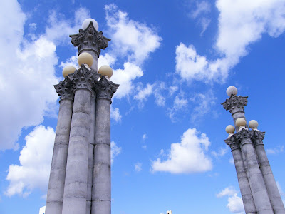
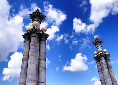
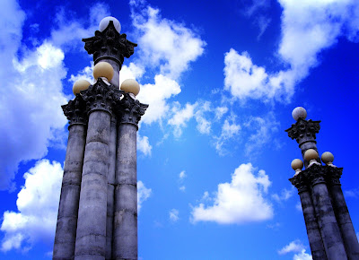
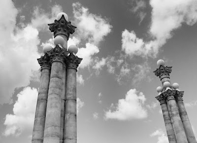
Here are four versions of the one photo I am pretty sure I will upload to the contest website. Help me decide which edit is best!
1) The original image:

2) Just a nudge in the right direction:

3) Lots of contrast - but is it too much?

4) Black and white - and maybe a little lifeless:

Whaddaya think?
I'll try to put a few more asking-your-opinion posts tonight and tomorrow. I'm far enough into this project to have lost all sense of judgment. Seriously.

4 comments:
I like the second one most.
I vote for number two on this one....love the color of the sky in the background.
I think I like number 2.
OK, I like #3 but it might be too much contrast for a photo contest. I don't know what the rules are. The sky is a bit more blue and the columns are darker. It's more dramatic and I like that.
Post a Comment